Classic Shell
http://www.classicshell.net/forum/

Suggestion for Settings window
http://www.classicshell.net/forum/viewtopic.php?f=7&t=2533
Page 1 of 1

Author:  ander [ Tue Apr 22, 2014 6:56 pm ]
Post subject:  Suggestion for Settings window

Hi,

Classic Shell has many settings, in many categories. In your Settings window, you've placed the category tabs in horizontal rows at the top. When you click a tab in the upper row, it's moved to the lower row (foreground), which causes all the other tabs to be "scrambled" to other places. This makes it pretty hard to go through all the categories when you set up the app. Because they move around so much, you have to keep starting over—looking back to the left each time and remembering which categories you've seen and which ones you haven't.

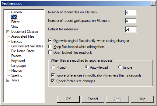
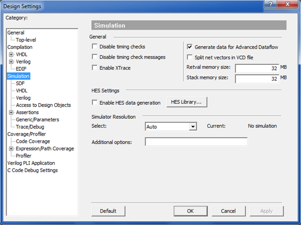
An easier, more modern approach is to put the categories in a vertical list at the left, so they remain stationary. This would also let you arrange them in expandable sub-categories, too, if you wished (see example below). Thanks for considering this!


Author:  Ivo [ Tue Apr 22, 2014 8:04 pm ]
Post subject:  Re: Suggestion for Settings window

This doesn't work very well because the tab names are localized in different languages and can be quite long.

Author:  ander [ Tue Apr 22, 2014 9:49 pm ]
Post subject:  Re: Suggestion for Settings window

So in such cases, is a 3rd (maybe even a 4th?) tab row created to make room for all those names? That must really be crazy. :?O

You can get a fair amount of text into a list:


If you're really worried about long strings, other options are to:

• Have the dialog box resize at runtime to accommodate the list's longest category.

• Add a horizontal scrollbar to the list, and/or

• Make the dialog box horizontally user-resizeable, where resizing affects only the list control.

Besides, do tabs wide enough to say things like "Access to Design Objects" and "Expression/Path Coverage" look better than list items that say those things? I don't think so... Long strings are actually a reason to use a list.

As a usability consultant, I assure you that many apps, in many languages, use vertical lists rather than skittering multi-row tabs. I'm sure that MRT's began as temporary kludge when extra categories were added to an existing project. They're not good GUI design. User controls shouldn't move around while you're trying to use them (unless, say, you're writing one of those gag apps with buttons that run away from your cursor when you try to click them).

And maybe I needn't point this out, but CS itself is a vertical (Start) menu for peeps who don't like horizontal (Start Screen) ones... Does this make a bit more sense when you see it that way? ;?)

Author:  Gaurav [ Tue Apr 22, 2014 10:02 pm ]
Post subject:  Re: Suggestion for Settings window

Technically, you can fit them all the tabs on one row by resizing the settings window. At today's resolutions, almost all PCs support at least 1280 horizontal resolution. Then tabs no longer switch rows. The size of the settings window is also saved.

I do agree that a vertical list is better.

Author:  ander [ Tue Apr 22, 2014 11:39 pm ]
Post subject:  Re: Suggestion for Settings window

Wow, you can resize the Settings window. I didn't even try that, as most dialog boxes are fixed (unresizable). That helps—thanks!

Page 1 of 1 All times are UTC - 8 hours [ DST ]
Powered by phpBB® Forum Software © phpBB Group
https://www.phpbb.com/